
Social

Client
Self-led
Read time
Client
5 min
Self-led
Read Time
5 min
Category
Category
Dating
Dating
Seven
Seven
Role
Role
UI/UX, Brand strategist
UI/UX, Brand strategist
Year
Year
2023
2023
Duration
Duration
2.5 months
2.5 months
PROJECT OVERVIEW
Make a first impression in seven seconds
Seven is a video-first dating app built for Gen Z and Millennials. It helps users connect through seven-second videos that are quick, authentic, and personality-driven. Unlike traditional dating apps that rely on static photos and bios, Seven focuses on short, authentic impressions that reflect how we consume content today.
As the only UI/UX designer, I led the project from conducting research to creating prototypes and running user tests. I spoke with users, identified pain points, and created a fresh, engaging experience to help people connect more naturally on dating apps.
PROBLEM STATEMENT
Too static, not enough spark
Modern dating apps feel like résumés—flat, static, and impersonal. Despite being more connected than ever, we’re lonelier, swiping endlessly through profiles we barely remember. Social platforms like TikTok have proven this: We crave motion, energy, vibes. So why does dating still feel like a chore?
Modern dating apps feel like résumés—flat, static, and impersonal. Despite being more connected than ever, we’re lonelier, swiping endlessly through profiles we barely remember. Social platforms like TikTok have proven this: We crave motion, energy, vibes. So why does dating still feel like a chore?
design opportunity
Less static, more cinematic
There is an opportunity to reimagine how people connect on dating apps by moving beyond static profiles and text-based bios. I plan to create a mobile app that uses short-form videos as the core of the dating experience, helping users vibe-check each other easier.
There is an opportunity to reimagine how people connect on dating apps by moving beyond static profiles and text-based bios. I plan to create a mobile app that uses short-form videos as the core of the dating experience, helping users vibe-check each other easier.
Design process
Design process
Research
Research
Design
Design
Test
Test
Deliver
Deliver
secondary research
Why short videos hook us
Surveys suggest that video content is more likely to captivate users than static imagery because it feels more immersive. The main reasons are the novelty and emotional value that video offers. Static images can share a message, but they often lack the motion and feeling that keep viewers interested. Videos are more entertaining and emotional, making users stay longer and even recommend them to others. This makes video a more effective way to hold attention, as it reaches deeper levels of user involvement than static images.
Surveys suggest that video content is more likely to captivate users than static imagery because it feels more immersive. The main reasons are the novelty and emotional value that video offers. Static images can share a message, but they often lack the motion and feeling that keep viewers interested. Videos are more entertaining and emotional, making users stay longer and even recommend them to others. This makes video a more effective way to hold attention, as it reaches deeper levels of user involvement than static images.
Surveys suggest that video content is more likely to captivate users than static imagery because it feels more immersive. The main reasons are the novelty and emotional value that video offers. Static images can share a message, but they often lack the motion and feeling that keep viewers interested. Videos are more entertaining and emotional, making users stay longer and even recommend them to others. This makes video a more effective way to hold attention, as it reaches deeper levels of user involvement than static images.
Surveys suggest that video content is more likely to captivate users than static imagery because it feels more immersive. The main reasons are the novelty and emotional value that video offers. Static images can share a message, but they often lack the motion and feeling that keep viewers interested. Videos are more entertaining and emotional, making users stay longer and even recommend them to others. This makes video a more effective way to hold attention, as it reaches deeper levels of user involvement than static images.
By combining motion, sound, and storytelling, videos stand a higher chance of catching a user’s eye as they scroll.” – “Video ads tend to drive more engagement than image ads” (Štefanović).
By combining motion, sound, and storytelling, videos stand a higher chance of catching a user’s eye as they scroll.” – “Video ads tend to drive more engagement than image ads” (Štefanović).
Designing for greater user engagement with video
Short-form videos are more emotionally engaging than static images. They combine motion, sound, and storytelling to create stronger connections. Platforms like TikTok have shown how quickly we connect with content when it feels authentic and expressive.
Research shows we form first impressions in just a tenth of a second, and within seven seconds, we’ve usually made up our minds. That insight inspired the name Seven—a dating app that puts video at the heart of the experience, making it easier for users to vibe-check each other quickly and authentically.

primary Research
Interviewing target users
Before exploring ideas, I needed to see what wasn’t working from the user’s point of view. I spoke to 10–12 Gen Z and Millennial users via focus groups to find common problems and needs.
The research focused on questions like:
How often do you use dating apps?
What do you like or dislike about them?
Do you feel like you’re making real connections?
What makes you swipe left—or stay interested?
From these chats, a few common pain points stood out. These were things that made dating apps feel frustrating, repetitive or not worth the time:
1
Most apps feel repetitive and surface-level
Users described the experience as monotonous—just endless swiping with little emotional engagement.
Users described the experience as monotonous—just endless swiping with little emotional engagement.
2
It’s hard to tell someone’s personality from just photos
Static images and curated photos fail to show the real person behind the profile.
Static images and curated photos fail to show the real person behind the profile.
3
Most users feel overwhelmed by long bios and profile prompts
Long bios and wordy prompts often feel like too much effort, especially for users with short attention spans.
Long bios and wordy prompts often feel like too much effort, especially for users with short attention spans.

Have a nice project?
Have a nice project?
Get in touch
Get in touch
design strategy
Project goals
To design Seven with purpose, I focused on three key goals:
Help users express their personality quickly and authentically through short-form video
Make discovering potential matches feel playful, light, and intuitive
Design a clean, minimal interface that encourages real engagement without distractions
These goals shaped every design decision I made throughout the project.
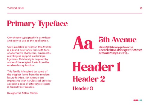
branding
Defining Seven's brand identity
I developed a consistent and memorable brand—from logo and colours to typography and voice—to reflect the app’s personality and connect with the target audience.
I developed a consistent and memorable brand—from logo and colours to typography and voice—to reflect the app’s personality and connect with the target audience.
I developed a consistent and memorable brand—from logo and colours to typography and voice—to reflect the app’s personality and connect with the target audience.
I developed a consistent and memorable brand—from logo and colours to typography and voice—to reflect the app’s personality and connect with the target audience.


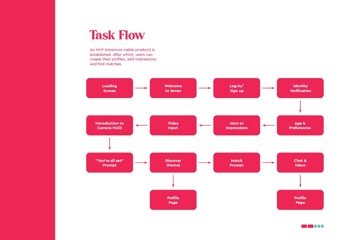
wireframing
Creating the task flow
I mapped out the core task flow from onboarding to making a connection. This served as a lightweight MVP tailored to the project’s timeline, ensuring the experience was focused, intuitive, and testable within a short sprint.
I mapped out the core task flow from onboarding to making a connection. This served as a lightweight MVP tailored to the project’s timeline, ensuring the experience was focused, intuitive, and testable within a short sprint.
I mapped out the core task flow from onboarding to making a connection. This served as a lightweight MVP tailored to the project’s timeline, ensuring the experience was focused, intuitive, and testable within a short sprint.
I mapped out the core task flow from onboarding to making a connection. This served as a lightweight MVP tailored to the project’s timeline, ensuring the experience was focused, intuitive, and testable within a short sprint.
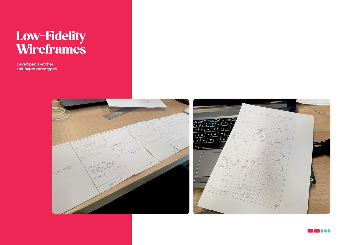
wireframing
Low-fidelity paper prototyping
I began with hand-drawn sketches to quickly explore layout ideas and user flows. This low-fidelity approach helped me visualise the core interactions, gather early feedback, and iterate rapidly before moving into high-fidelity design.
I began with hand-drawn sketches to quickly explore layout ideas and user flows. This low-fidelity approach helped me visualise the core interactions, gather early feedback, and iterate rapidly before moving into high-fidelity design.
I began with hand-drawn sketches to quickly explore layout ideas and user flows. This low-fidelity approach helped me visualise the core interactions, gather early feedback, and iterate rapidly before moving into high-fidelity design.
I began with hand-drawn sketches to quickly explore layout ideas and user flows. This low-fidelity approach helped me visualise the core interactions, gather early feedback, and iterate rapidly before moving into high-fidelity design.
wireframing
Building Seven - High-fidelity prototyping
Using the task flow and low-fidelity sketches as a foundation, I designed high-fidelity screens guided by the final style guide. This version applied the visual identity, layout consistency, and interaction patterns. I added and annotated key features to explain design intent and functionality.
Using the task flow and low-fidelity sketches as a foundation, I designed high-fidelity screens guided by the final style guide. This version applied the visual identity, layout consistency, and interaction patterns. I added and annotated key features to explain design intent and functionality.
Using the task flow and low-fidelity sketches as a foundation, I designed high-fidelity screens guided by the final style guide. This version applied the visual identity, layout consistency, and interaction patterns. I added and annotated key features to explain design intent and functionality.
Using the task flow and low-fidelity sketches as a foundation, I designed high-fidelity screens guided by the final style guide. This version applied the visual identity, layout consistency, and interaction patterns. I added and annotated key features to explain design intent and functionality.


prototyping
Try it out yourself
A live, clickable prototype was created to simulate the user experience and support usability testing (click this link if it's not displaying properly):
A live, clickable prototype was created to simulate the user experience and support usability testing (click this link if it's not displaying properly):
A live, clickable prototype was created to simulate the user experience and support usability testing (click this link if it's not displaying properly):
A live, clickable prototype was created to simulate the user experience and support usability testing (click this link if it's not displaying properly):
USABILITY TESTING
Testing with real users
I invited the same Gen Z users I interviewed earlier to test the working prototype. This gave me continuity in feedback and helped validate whether the design addressed their initial pain points:
“This feels way more natural than scrolling through photos.”
Users appreciated the video-first approach, saying it helped them feel a stronger sense of personality and presence.“I’d love a prompt or example before recording.”
Some users hesitated when facing the camera. I added a short prompt system to guide them and break the ice.“I can see myself using this when I’m bored, just to see people’s vibes.”
This validated our goal of creating an engaging, scroll-friendly interaction that feels fun and low pressure.
Reflection
Final thoughts
Designing Seven helped me understand the power of emotion and personality in creating meaningful digital experiences. By leaning into video as the core medium, I was able to turn user insights into a product that felt more human and engaging. If I were to continue this project, I’d explore onboarding improvements and deeper personalisation to further support authentic connections.
Designing Seven helped me understand the power of emotion and personality in creating meaningful digital experiences. By leaning into video as the core medium, I was able to turn user insights into a product that felt more human and engaging. If I were to continue this project, I’d explore onboarding improvements and deeper personalisation to further support authentic connections.
Designing Seven helped me understand the power of emotion and personality in creating meaningful digital experiences. By leaning into video as the core medium, I was able to turn user insights into a product that felt more human and engaging. If I were to continue this project, I’d explore onboarding improvements and deeper personalisation to further support authentic connections.
Designing Seven helped me understand the power of emotion and personality in creating meaningful digital experiences. By leaning into video as the core medium, I was able to turn user insights into a product that felt more human and engaging. If I were to continue this project, I’d explore onboarding improvements and deeper personalisation to further support authentic connections.