Client

Self-led

Read time

Client

3 min

Self-led

Read Time

4 min

Category

Category

Food and beverage

Food and beverage

Tako grill

Tako grill

Role

Role

UI/UX, Web designer, Web developer

UI/UX, Web designer, Web developer

Year

Year

2024

2024

Duration

Duration

1.5 months

1.5 months

PROJECT OVERVIEW

Learning to code through a site revamp

I redesigned an existing sushi restaurant website as part of a school project focused on learning how to code using HTML and CSS. This was my first experience building a site from scratch, so the priority was to understand the fundamentals of web structure and styling. The original site had poor usability and outdated visuals, which gave me a clear opportunity to improve its layout, clarity, and overall aesthetic. The result is a cleaner, more modern website that enhances both usability and brand presence.

PROBLEM STATEMENT

From outdated to user friendly

Many older websites suffer from unclear navigation, cluttered layouts, and outdated visuals. The original sushi website I was assigned had poor usability, inconsistent design, and lacked a clear hierarchy. For users trying to view the menu or make reservations, the experience felt confusing and frustrating. The main goal of this project was to learn how to code using HTML and CSS while identifying key usability issues and redesigning the site to be cleaner, more intuitive, and easier to navigate.

Design Process

Design Process

Research

Research

Design

Design

Test

Test

Deliver

Deliver

research

Laying the groundwork

Before diving into the redesign, I spent time learning the fundamentals of HTML and CSS. This included understanding semantic tags, class and ID selectors, styling with CSS properties, and experimenting with responsive layouts using Flexbox and Grid. I also practised building basic page structures and applying media queries to ensure layouts could adapt across different screen sizes.

Once comfortable with the basics, I reviewed the original website’s structure and identified key usability issues. From a user perspective, it was difficult to access essential information like the menu, opening hours, and reservation details. To guide my redesign, I explored examples of well-designed restaurant websites to understand what made them intuitive and visually appealing. This involved studying layout patterns, navigation behaviours, and UI conventions within the food and beverage space. I also created a simplified sitemap to establish a clearer content hierarchy and improve the overall user experience.

Have a nice project?

Have a nice project?

Get in touch

Get in touch

© 2025

gerardcarlq

Have a nice project?

Have a nice project?

Get in touch

Get in touch

© 2025 gerardcarlq - All Rights Reserved.

design strategy

Project goals

To redesign the website with clarity and purpose, I focused on three main goals:

  • Apply clean, consistent styling to improve readability and reduce visual clutter

  • Use layout systems like Flexbox and Grid to create a responsive and structured interface

  • Design intuitive navigation that makes key information such as the menu and reservations easy to find

These goals guided my approach to layout, visual direction, and code implementation, helping to create a user experience that feels both functional and polished.

To redesign the website with clarity and purpose, I focused on three main goals:


  • Apply clean, consistent styling to improve readability and reduce visual clutter


  • Use layout systems like Flexbox or Grid to create a responsive and structured interface


  • Design intuitive navigation that makes key information such as the menu and reservations easy to find


These goals guided my approach to layout, visual direction, and code implementation, helping to create a user experience that feels both functional and polished.

To redesign the website with clarity and purpose, I focused on three main goals:

  • Apply clean, consistent styling to improve readability and reduce visual clutter

  • Use layout systems like Flexbox and Grid to create a responsive and structured interface

  • Design intuitive navigation that makes key information such as the menu and reservations easy to find

These goals guided my approach to layout, visual direction, and code implementation, helping to create a user experience that feels both functional and polished.

To redesign the website with clarity and purpose, I focused on three main goals:

  • Apply clean, consistent styling to improve readability and reduce visual clutter

  • Use layout systems like Flexbox and Grid to create a responsive and structured interface

  • Design intuitive navigation that makes key information such as the menu and reservations easy to find

These goals guided my approach to layout, visual direction, and code implementation, helping to create a user experience that feels both functional and polished.

art direction

Shaping the visual language

To reflect the authenticity of traditional Japanese dining, I aimed for a visual direction that felt handcrafted and culturally rooted. I avoided overly modern aesthetics in favour of something that looked warm, honest, and inviting, similar to a neighbourhood sushi shop.

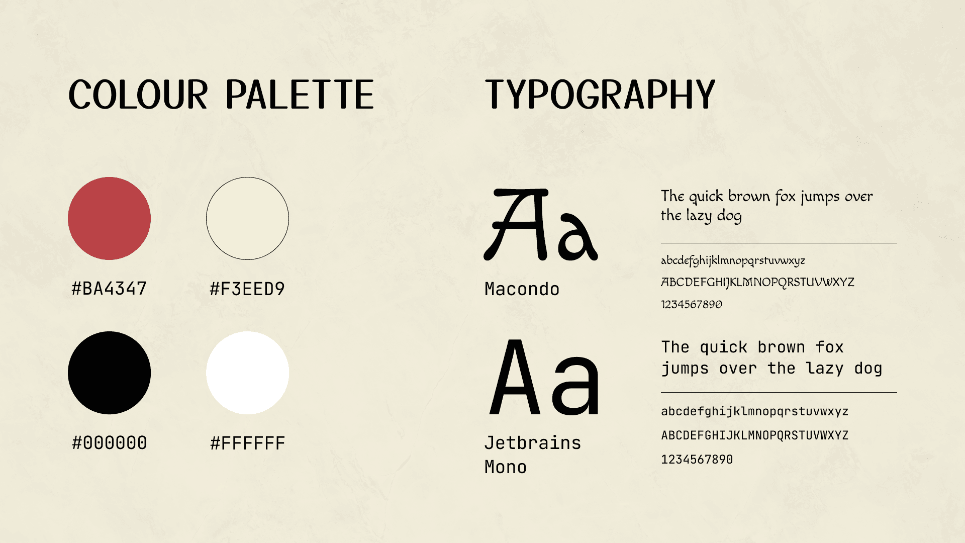
I used Macondo as the display typeface to add character and charm, inspired by brush calligraphy and hand-painted signage. For body text and UI elements, I chose JetBrains Mono for its clean, monospaced structure that offered clarity while adding a subtle nod to structured design.

The colour palette consisted of red, black, white, and pale yellow, evoking classic sushi visuals and traditional interior tones.

prototyping

From concept to critique

I built the website using HTML and CSS, focusing on translating the visual direction and layout ideas into a fully functioning prototype. This hands-on process allowed me to put my newly learned coding skills into practice and understand how structure, styling, and responsiveness work together to shape the user experience.

The build was highly iterative. I refined the layout and made adjustments based on peer feedback. Reviews were constructive and helped me improve the accessibility and clarity of key interactions. Many appreciated the improved usability and the thoughtful visual consistency that brought the brand story to life.

reflection

Final thoughts

Overall, I’m proud of how the project turned out. The final website feels clean, structured, and visually aligned with the traditional sushi dining experience I set out to convey. More importantly, it gave me the opportunity to learn HTML and CSS from scratch while understanding how code and design work hand in hand.

The process pushed me to think more critically about usability, hierarchy, and visual clarity. It was a rewarding introduction to coding and web design, and it laid a strong foundation for future projects that balance both function and aesthetics.

Overall, I’m proud of how the project came together. The final website successfully delivers an immersive, visually cohesive experience that reflects the theme and intent behind the content. The process allowed me to push my creative boundaries while staying grounded in usability and structure.

As an extension of this work, I also created a social media–inspired chess learning platform on Instagram. It’s designed to teach beginners how to play chess using similar design principles and visual language from the website. You can explore and test it through this link, and I’ve also included the link of the full website below for anyone to try (only designed for desktop).

Overall, I’m proud of how the project turned out. The final website feels clean, structured, and visually aligned with the traditional sushi dining experience I set out to convey. More importantly, it gave me the opportunity to learn HTML and CSS from scratch while understanding how code and design work hand in hand.

The process pushed me to think more critically about usability, hierarchy, and visual clarity. It was a rewarding introduction to coding and web design, and it laid a strong foundation for future projects that balance both function and aesthetics.

Have a nice project?

Have a nice project?

Get in touch

Get in touch

© 2025 gerardcarlq - All Rights Reserved.